
UofTaste
Improving How Students Schedule Campus Meals
Type: Academic Course Project
My Contributions
Created and distributed surveys
Usability tests and synthesized results
Created user journey, wireframes, and high-fidelity prototype
Iterated screens based on user feedback
Team
5 people
Tools
Figma, Figjam
Duration
3 months
"Where can I find fast and affordable places to eat around campus?" 😋
Problem Statement
UofT Students with limited time and energy to cook their own meals need a way to find and access food that is affordable and quick to get.
Solution
UofTaste is an Apple Calendar plugin that optimizes meal planning for university students by recommending campus dining options based on their class schedule locations.
📊 Research Process
Survey & Interview Insights
Exploring the Dining Preferences and Habits of UofT Students
My group and I wanted to confirm whether our struggles with finding food at UofT were a problem for the general UofT student population. Through 4 interviews and 33 survey responses, we found that...
97% purchase meals at least once per week
77% use Google Maps to find new eateries
67% have < 30 min to eat on campus
67% seldom rely on discounts for new eateries.
53% rate campus food cost 7/10 (expensive)
UofT students are saying this about Google Maps…
“It's difficult to get prices of foods and know which places offer student discounts”
“It's hard to understand ratings and many small places are hidden”
Persona
Empathizing with Users to Address Goals and Pain Points
Focusing on UofT students helped paint a better picture of the target audience.

Design Requirements
Five Research-Backed Requirements
1. Quick and easy process of finding a vendor
2. Include information on which places offer student discounts and exact prices foods
3. Display smaller businesses and food trucks
4. Give more affordable food options on campus
5. Include ways to help students explore new vendors
💡 Solution Phase
Ideation
Generating Design Solution Ideas
Based on our findings, we came up with 3 design solutions in our brainstorm session based on impact and feasibility.
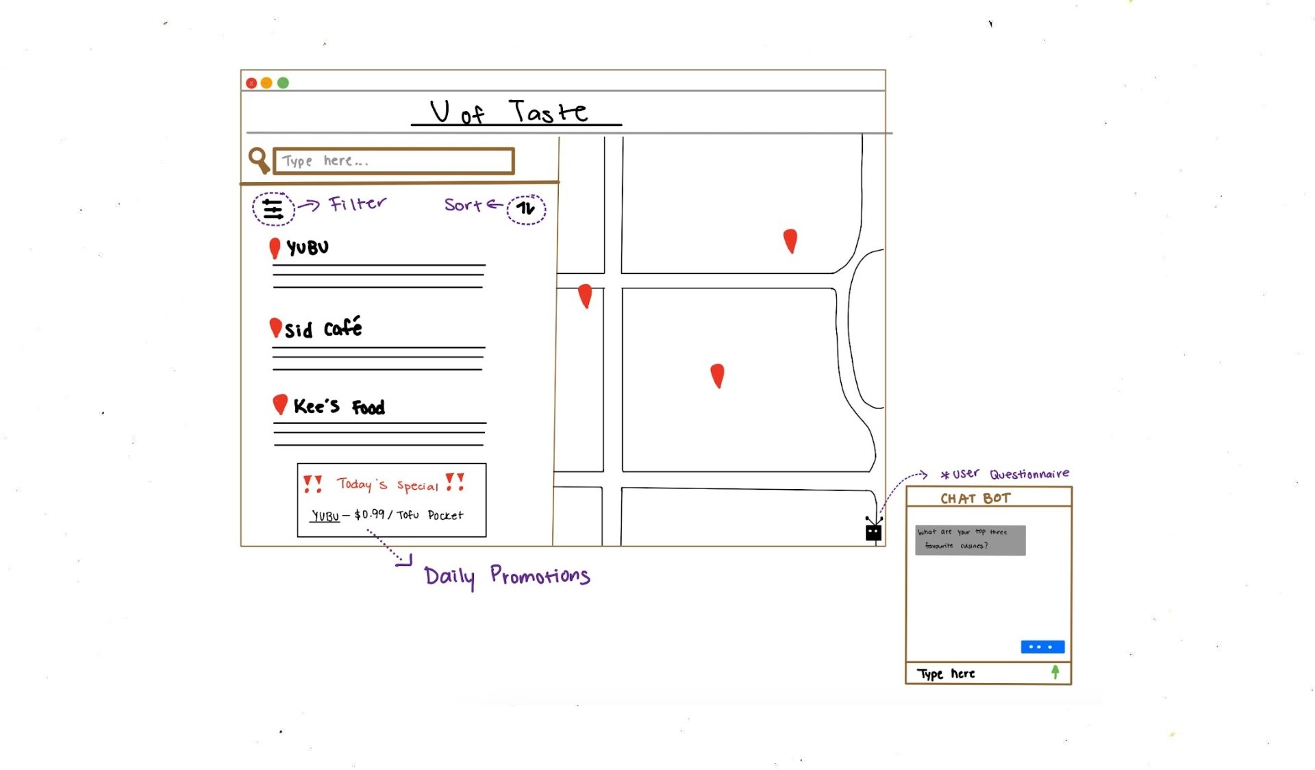
App/Website Navigator
Displays all campus food vendors with a map and filters based on user preferences. Daily vendor promotions will be highlighted, and users can fill out a short questionnaire to refine recommendations. Saved preferences enable quick, personalized access on future visits.
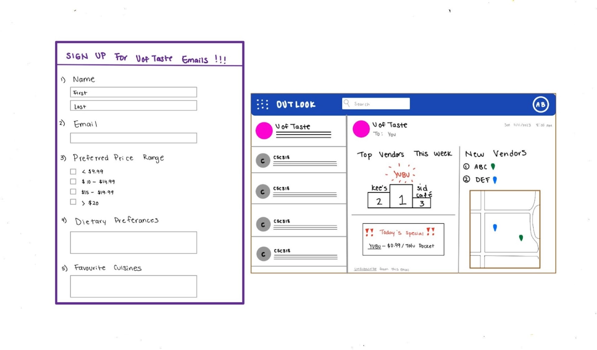
Subscription Emails
Users can sign up for a subscription service by filling out a form with preferences (e.g., price range, dietary needs, favorite cuisines). After subscribing, they’ll receive weekly emails with personalized vendor recommendations and discounts/promotions from nearby small businesses.
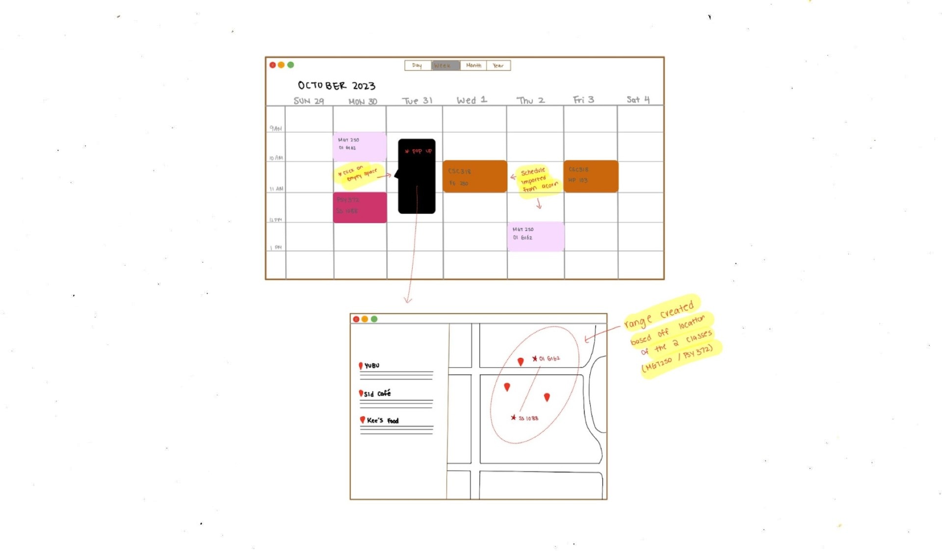
Timetable Inputter
A software that integrates with the user’s UofT timetable to recommend nearby food spots, tailored to fit their schedule and location constraints.
—> We chose the timetable inputter, for its convenience.
It pulls users’ schedules directly from their calendar, providing food suggestions based on timing and nearby locations without needing additional input.
Paper Prototype
Creating a Simple Model of the Timetable Inputter
After importing a student's timetable to the Apple calendar, the plugin will recommend vendors based on the student's previous and next location.
Design features:
Like functionality: Sort options by likes to see which places are popular among other students.
Sorting menu: Quickly search for a specific cuisine based on criteria like proximity, price, and popularity.
Vendor details page: Highlights vendors' top 3 most popular dishes, giving users a quick overview of their offerings. Users can also view the entire menu if they like.
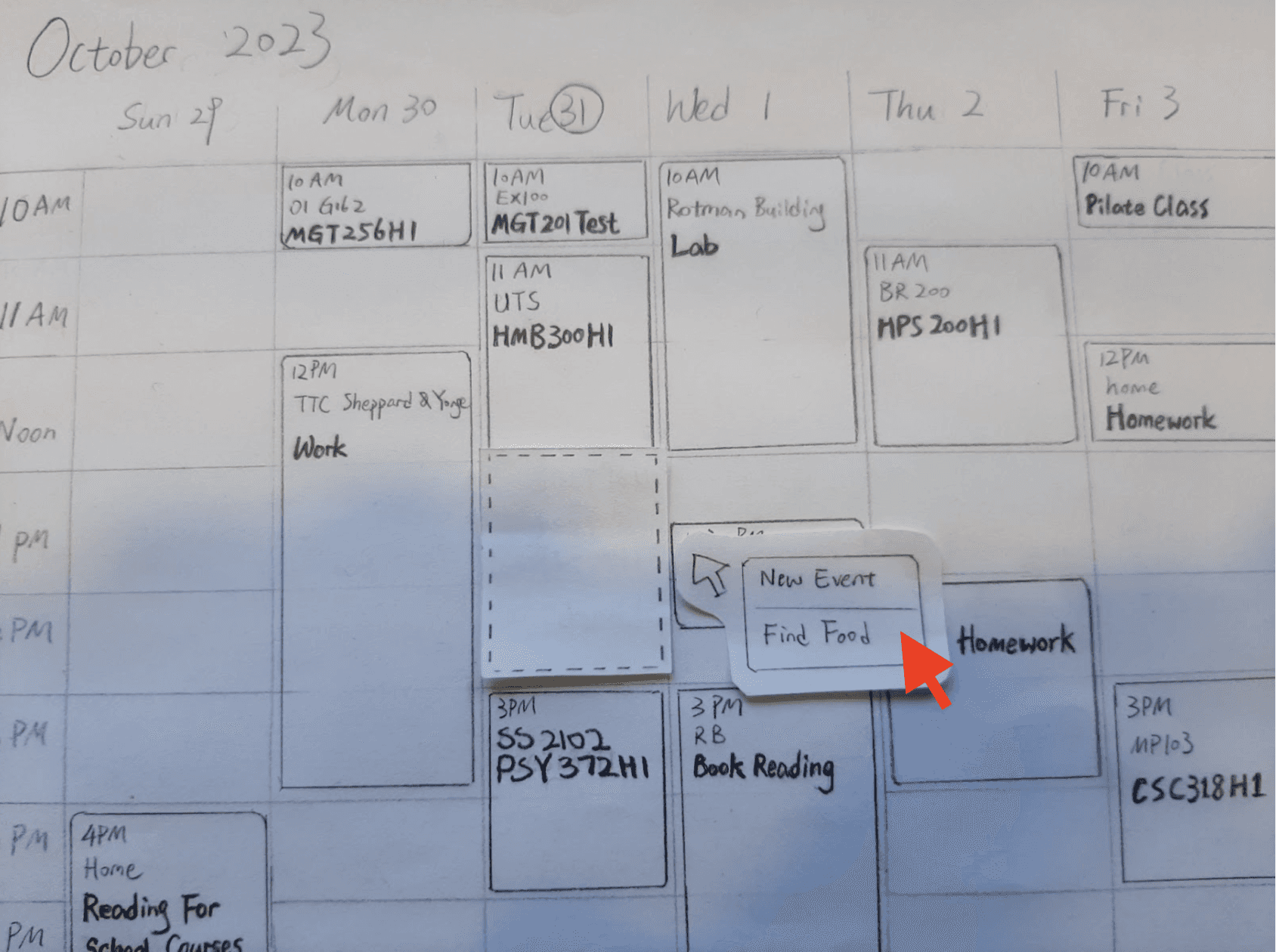
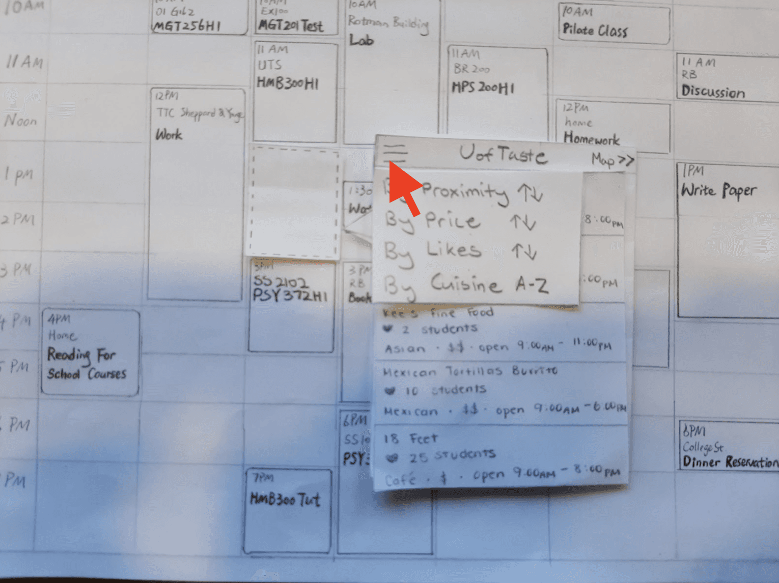
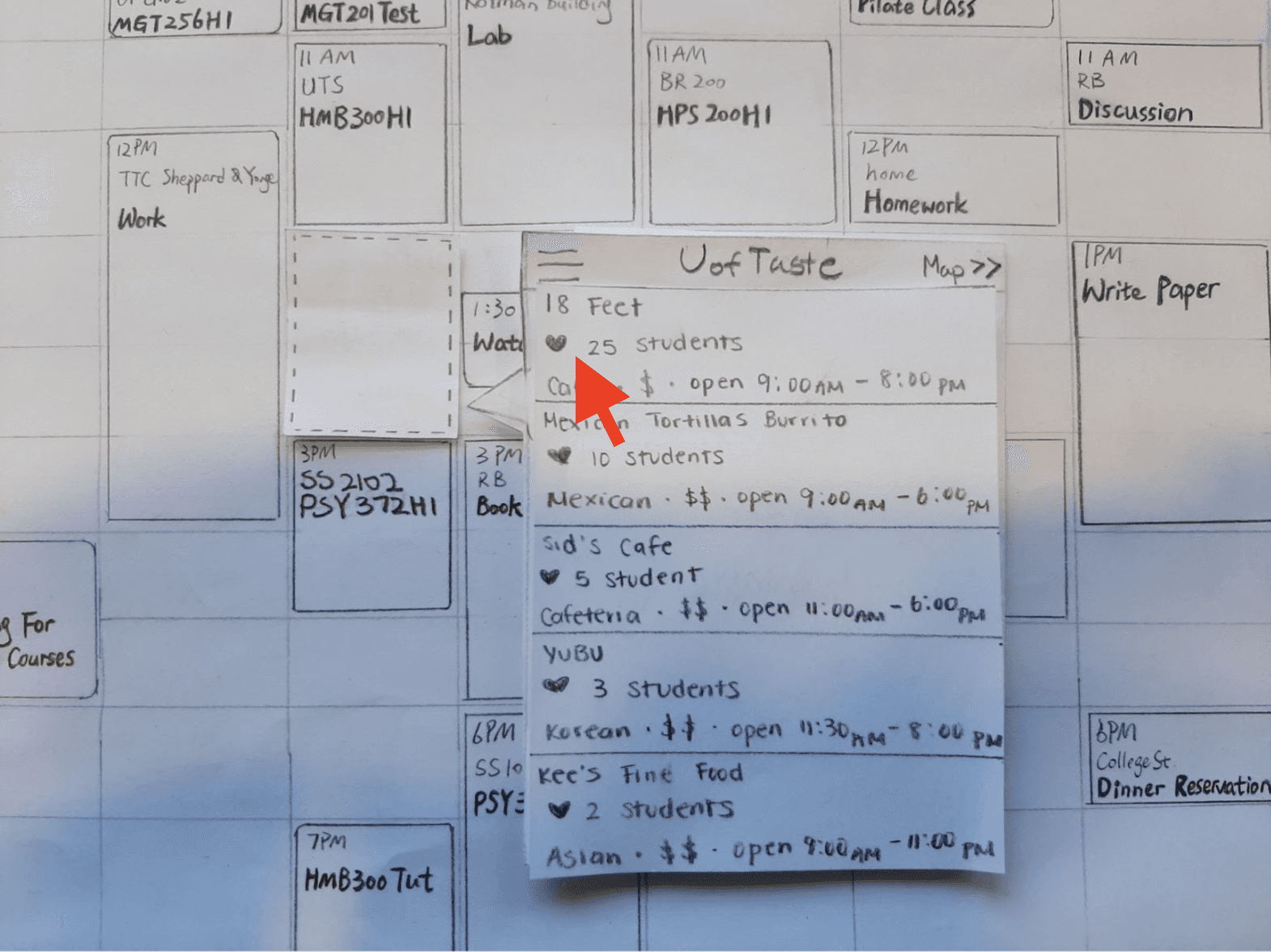
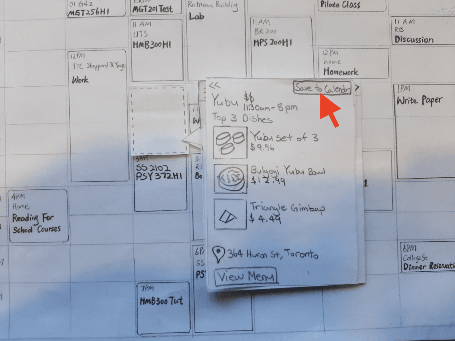
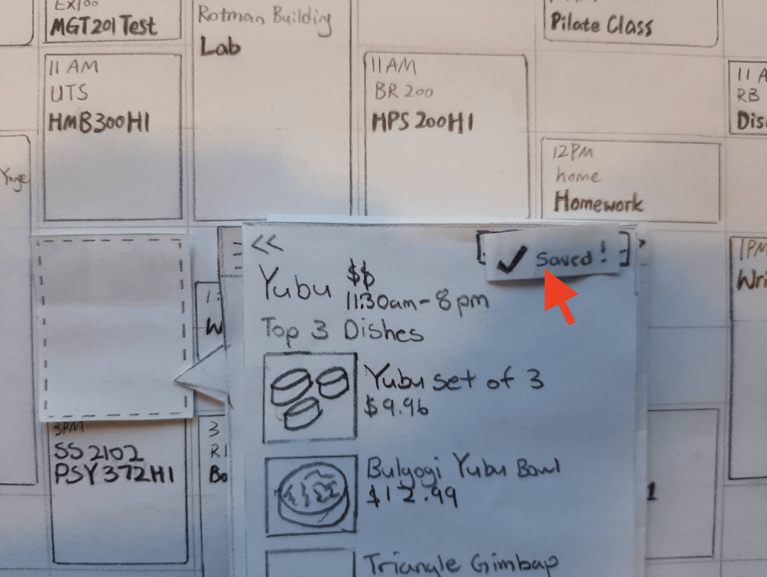
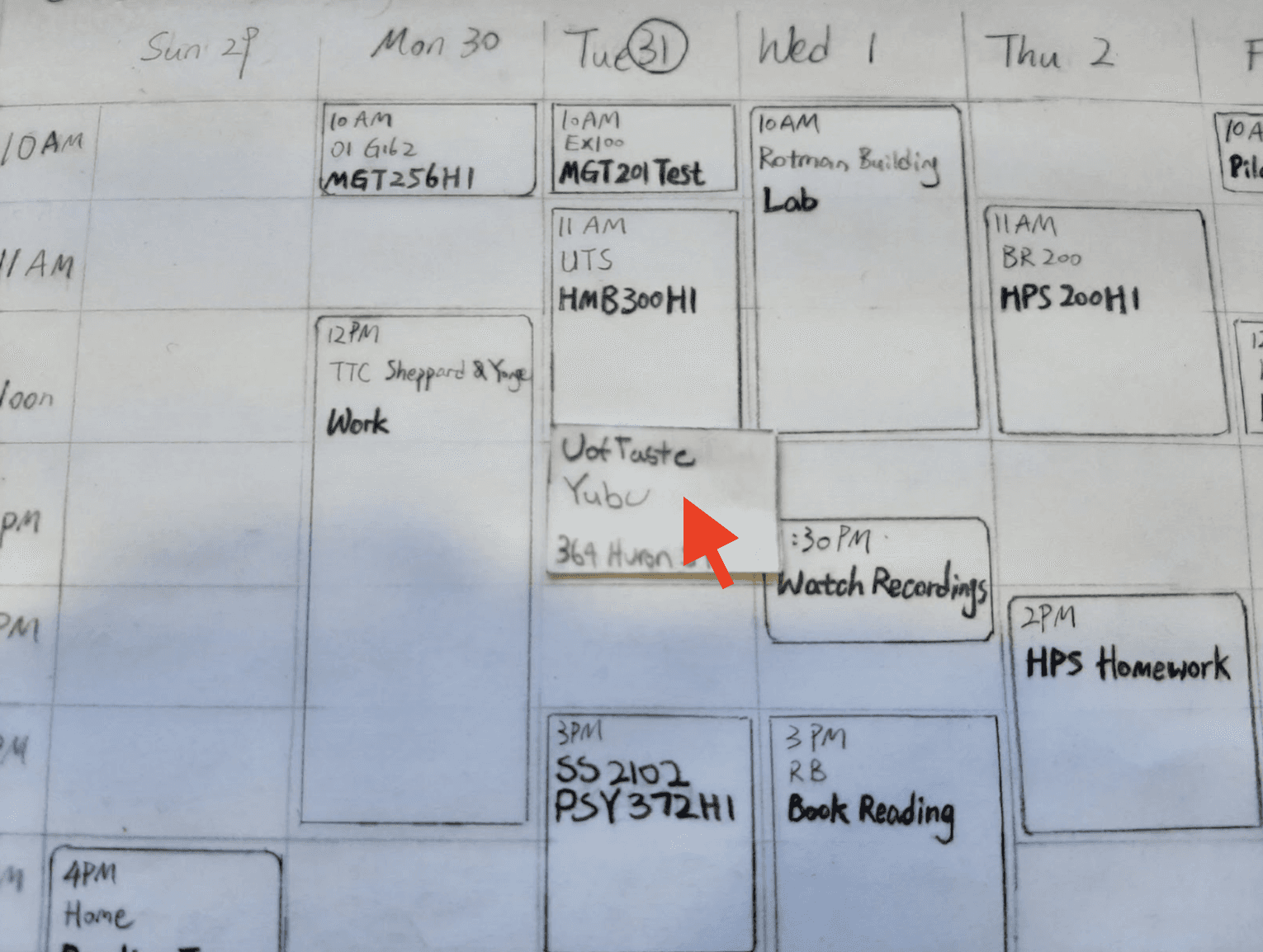
Task: Sort the vendors by likes and save the most popular restaurant to the calendar.
Testing the Paper Prototype
After conducting heuristic evaluations (evaluating the prototype against usability principles) with 6 experts and think-aloud evaluations (hearing users' thought process) with 5 UofT students, we identified 6 key findings:
Heuristic
The design fails to highlight its main purpose of saving dining locations to the calendar.
The hamburger icon is unsuitable for the 'sort' option.
Actionable buttons and informational elements need clearer differentiation.
Think-aloud
The design's purpose becomes evident only after initial use.
Users need a clear confirmation when the UofTaste plug-in is installed.
The refresh icon is unclear for swapping vendors.
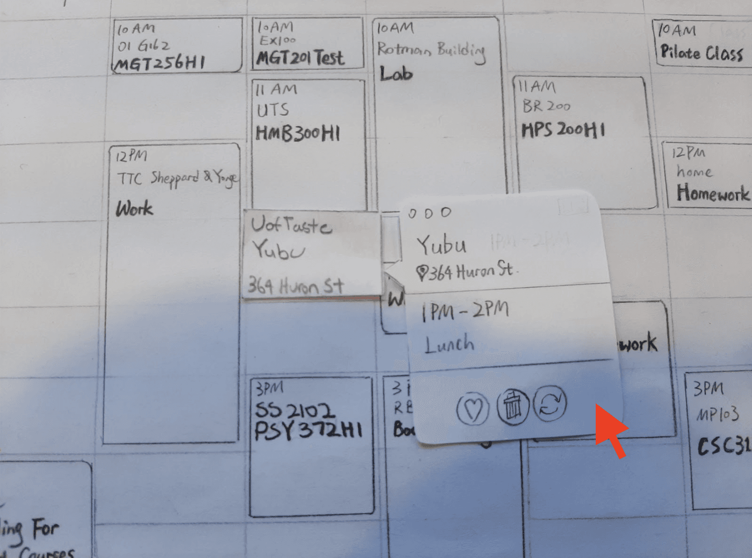
Design Iterations
Refining the Design Using Feedback
Using the feedback from testing the paper prototype, we made 5 key changes to the low-fidelity prototype.

Added an icon of plug-in in calendar view with instructions for beginners

Icons made more clear ("Sort", "Change")

Added pinpoints for the start and end locations (between classes)

Added icons of vendor types, discounts, and preferences

Main functionalities are more obvious - "Save to calendar" button
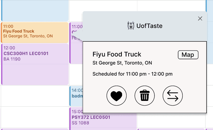
Usability Study
Testing the Low-fidelity Prototype
We conducted another round of testing with UofT students, focusing on our primary flow of scheduling meals in designated time slots, and gathered their feedback.
👍🏼 Positive feedback
Less misleading & noisy results than traditional Google Maps.
Adding a schedule is very intuitive (30 - 60 sec from start to finish)
👎🏼 Constructive feedback
Not helpful for students who don’t use the Apple calendar regularly.
Map function wasn’t as obvious as expected before making selections.
No navigation map after saving a place.
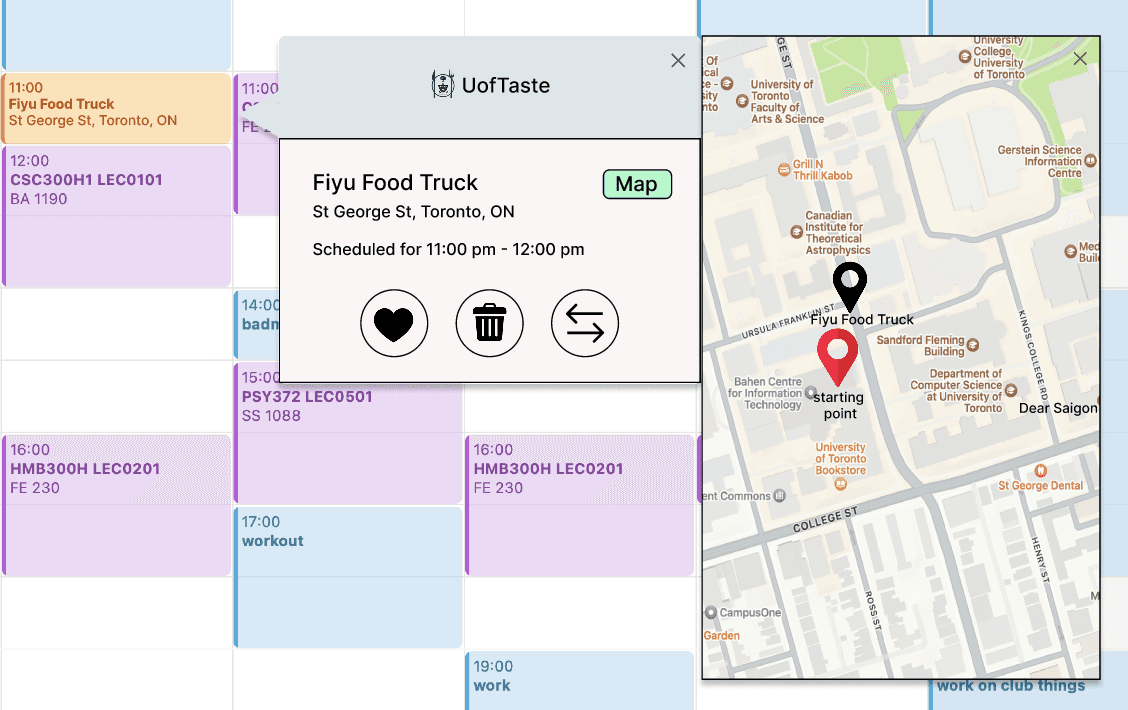
Design Iterations
Refining the Design Using Feedback (2)
To address the feedback that there was no navigation map after a place was saved in the calendar, we added a button to open a map, with pin points showing starting point locations and location of the vendors they scheduled.
Try out the high-fidelity prototype!
Select a time slot on Tuesday 11-12 pm or 2-3 pm.
Lessons Learned
The purpose of a prototype may be clear to its creators, but it is not always obvious to users.
During our first usability test, we discovered that users didn’t understand what our prototype was trying to achieve. While this may be surprising at first, it reinforced the importance of listening to users: prototypes must not only demonstrate functionality but also guide users intuitively through intent and interaction. If users don’t understand the purpose, the prototype has failed to serve its function.
Think outside the box!
During ideation, we could have stuck with mainstream solutions like a standalone app or website. By exploring alternatives, we developed a solution that didn’t exist before and better served users by integrating with their existing calendars, making onboarding seamless and aligned with their routines.