Modernizing how Ontarians purchase licence plates
Overview
Redesigned a government service and increased CSAT 51% → 93%
My Contributions
Facilitated 10 usability testing sessions, synthesized insights, iterated designs, updated the design system, and presented findings to stakeholders.
Team
3 Designers
1 Business Analyst
1 Project Manager
3 Engineers
1 Consultant
+ more…
Type
Internship
Shipped
Year
2025 - 2026 (8 months)
Tools
Figma, Miro, Azure
A design system team once told me no.
I built the case anyway, and while that specific fight didn't close, the same approach worked on the next project.
Context
Ontario's Personalized Licence Plate (PLP) online website was being modernized, but user satisfaction was low (51%).
With 30K monthly-active users and complaints surfacing in feedback, this meant people were contacting support or completing purchases without confidence they'd done it right, which is a real cost for a paid government service.
My role
I recruited and facilitated two rounds of usability testing, synthesized findings across 18 sessions, and worked directly with engineers, product managers, and business analysts to translate research into shipped changes in the Figma prototype, design system, and live content.
Problems & Solutions
The Core Tension
Design system vs. user need
⚠️ Usability testing consistently showed that participants didn't understand what a Registration Identification Number (RIN) was, and many wanted that clarification before choosing between a Driver's Licence number and a RIN so they could choose with confidence.
However, the design system only supported hint text after a selection was made.
When I raised this insight, the design system team pushed back, defending why the pattern shouldn't change.
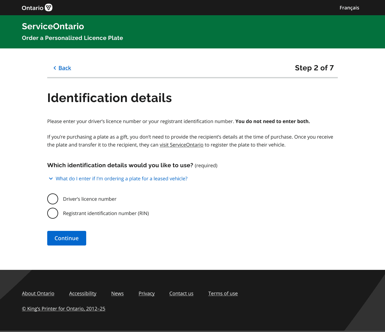

💡 Rather than let it drop, I helped built a design rationale document: usability findings, before-and-after mockups, and the psychological decision-making principle behind the recommendation.
It wasn't a full win; the proposal was taken back for future consideration rather than adopted outright. Despite that, it became a case that could be picked back up later, and it shaped how I approached the next design-system constraint I ran into (explained later).
Supporting Challenges
Making the research & cross-functional communication work
Recruitment friction
⚠️ Standard outreach (snowball method) led to ghosting and low response rates.
💡 To recruit enough participants, we expanded beyond Slack into word of mouth, private Discord channels and Instagram, while navigating the government's strict anti-spam policy on public outreach.
We also proposed a standardized usability testing outreach process for Ontario Government social channels, designed as a scalable solution for adoption across the broader government rather than just PLP. The proposal has since been considered and is currently a work in progress.
Clustering at scale
⚠️ My earlier academic approach (grouping all insights by feature) broke down at 18 sessions across two rounds; too much lived under one umbrella with no internal structure.

💡 With lots of experimentation, I developed a new method instead: within each feature, first sort into broad themes (i.e. positive feedback, negative feedback, questions, expectations, behaviors), then break each theme into specific insights.
Starting with broad impressions before diving into details made findings faster to synthesize and easier to communicate to cross-functional teams.

Figma version control chaos
⚠️ With business analysts and engineers commenting directly on the file, older flows kept getting mistaken for current ones because the page size was huge, and some iterations never made it into UAT.

💡 I helped reorganized the entire file so the most recent flow was always clearly separated from an archive of older iterations.
Since Figma's annotation feature doesn't include dates, I manually added dates to every design iteration annotation so anyone could tell at a glance whether feedback applied to a recent change or an outdated one.

From Insight to Interface
Design iteration examples
Beyond the hint text issue, usability testing uncovered several additional friction points that informed design iterations. The table below includes some examples:
User research insight
Design iteration
Users were unsure if the homepage cost was final, or if HST and shipping would be added later
Clarified total cost upfront
When gifting a PLP, users didn't know whose ID to enter
Explained the gifting scenario early in the flow
Users didn't understand internal terms like "transferring plates"
Rewrote section headings, paragraphs, and error messages in plain language
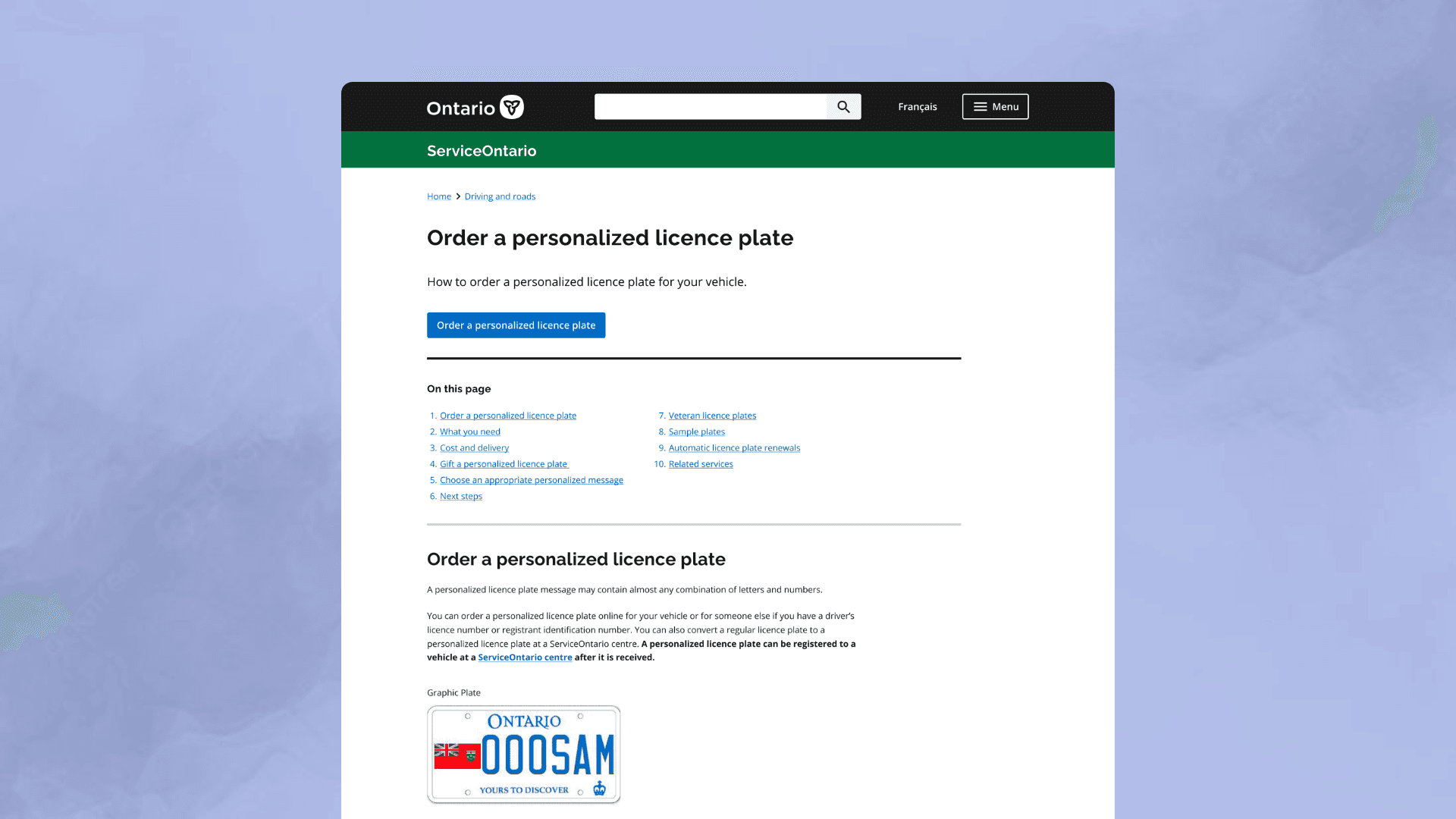
Users wanted to see what a PLP actually looks like before ordering
Added an example PLP image on the homepage
Users wanted to confirm their exact plate before paying
Added an image of the user's selected PLP on the payment page
Outcome
📈 CSAT among completed PLP transactions rose from 51% to a 93% average over 7 months post-launch (~250 responses total).
📉 Cross-functional confusion over design iterations dropped, and UAT stayed consistently aligned with the current flow.
The Rationale Document Pays Off
Design system vs. user need (part 2)
Using PLP's success as a foundation, I supported a second round of usability testing for the new Graphic Licence Plate (GLP) service, which reused the PLP flow as its base.
⚠️ One finding stood out:
Users faced heavy cognitive load scrolling through every plate graphic at once on the homepage.
Once again, I found that the design system had a relevant component, an accordion (category-select), but it only supported text placeholders, not images.

💡 This time, I updated the component to support image-based category placeholders, allowing users to filter graphics after selecting a category instead of scrolling through the entire library. It tested well in usability testing and, unlike the hint text proposal, was accepted for the GLP build.


Lessons Learned
The most rewarding part wasn't the CSAT metric, it was everything I had to learn to get there
Rejected ≠ wasted effort
The hint text recommendation didn't get adopted immediately, but the rationale doc built a case that could be picked back up later. The same evidence-based approach (real research, before-and-after mockups, clear reasoning) is what made the GLP proposal land when a similar constraint came up again.
Synthesis strategy has to match scale, not habit
What worked for a smaller academic project didn't hold up at 18 sessions, and adapting the method is what made it possible to keep pace with the volume. Additionally, working with two other designers, I noticed synthesis didn't need to follow the same style for each person, as long as the themes were clear and easy to follow for presentation.
Documentation is what makes an imperfect system work
Something obvious to a design team (e.g. when an iteration was made) isn't obvious to the rest of a cross-functional team. Splitting the Figma file into "recent changes" and "archives," with dated comments, closed that gap and cut down the back-and-forth.

The wonderful cross-functional team 🤝 🎯 🏆